Google’s March 2024 Updates: What’s to Blame for Your Rankings Drop?
Google’s got some big updates rolling out, and already, webmasters are seeing noticeable impacts on their sites, both positive and negative. Since it could take up to a month for the dust to settle, you don’t necessarily need to panic quite yet, but you do need to take a hard look at what these updates […]

How to Create Good Content With Help From AI
The advent of generative AI has made it easy to create content for websites, but creating good content is another matter. Webmasters and self-described SEO experts have unleashed a flood of what’s basically website spam, using AI to churn out mountains of quick, machine-written pages in the hopes that some of them might rank well. […]
The New Most Important SEO Tool Is One You Already Have
It seems like just about every month, the SEO community gets into a tizzy because there’s another Google update. Often, it’s a core update, a routine improvement to Google’s algorithms (though “improvement” can be subjective, depending on how the results shake out for your site). And usually, there’s nothing specific that Google can tell us […]
What Can You Bring to the Table? Looking at the Future of Ranking
In the world of SEO, artificial intelligence is coming at us from both sides. On one side, we have Google’s Search Generative Experience (SGE) and the new AI-powered Bing, both of which can generate answers to user queries that often don’t require a click: People can get the information they want without ever leaving Google […]
Let’s Talk AI and Google.
Let’s have a Talk about Artificial Intelligence (AI) Ok…we must talk about AI….it is here NOW, and I predict that 2023 will be the year that AI will have a major impact on nearly Everything. With the release of ChatGPT a few weeks ago, the world has moved into new era’s of information. AI will […]

How to Detect AI-Generated Content (and Can Google Do That)
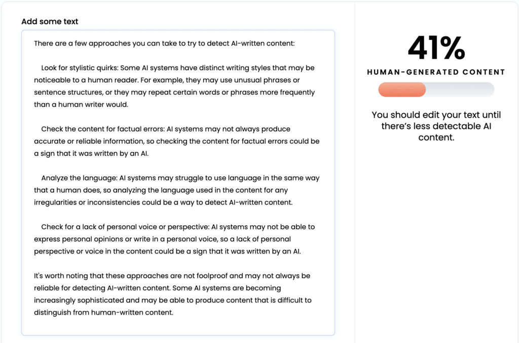
Artificial Intelligence is taking the SEO industry by storm, and as it often happens in our community, there have been lots of discussions about how to use AI to manipulate ranking signals scale, especially content. AI tools can write original content, and, from the reader’s point of view, good content. In fact, some AI-written content […]

8 Crazy Useful Instagram Hacks To Try Right Now
Instagram has become one of the hottest social networks around. But did you know you can do more than just post photos? Here are eight insanely, awesomely helpful hacks to try right now. Change The Format Of Your Picture Once upon a time you could only use squares for your Instagram photos. Which was a […]
How to Do Link Building in 2022-2023
How should we be doing link building in late 2022 and into 2023? Jim Boykin, CEO of Internet Marketing Ninjas, and Ann Smarty, IMN’s analyst, discuss how link building should work (and how we don’t recommend it working). Link building starts with creating something linkworthy. This could be a very useful tutorial, a niche report, […]
Many sites aren’t using their blog correctly – are you?

Every site we’ve ever looked at has content that is buried so deep into the architecture of the site that it has 0 chance to rank. And the reason for important content getting buried is usually the inherent way blogs work: As you add new and new content, older content goes down its archive and […]
Using and Optimizing Images: Search and Social Optimization Cheat Sheets
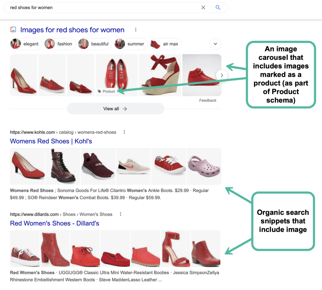
If you are running a website, there are most likely going to be plenty of images there. While image-specific SEO is very-well explained in a few detailed guides, let’s try to create a very simple and easily-organized guide to using images properly: 1. Free Images You *Can* Use First things first: let’s see where you […]